- I capture quiet moments that often go unseen.
light, texture, and space telling their own story.

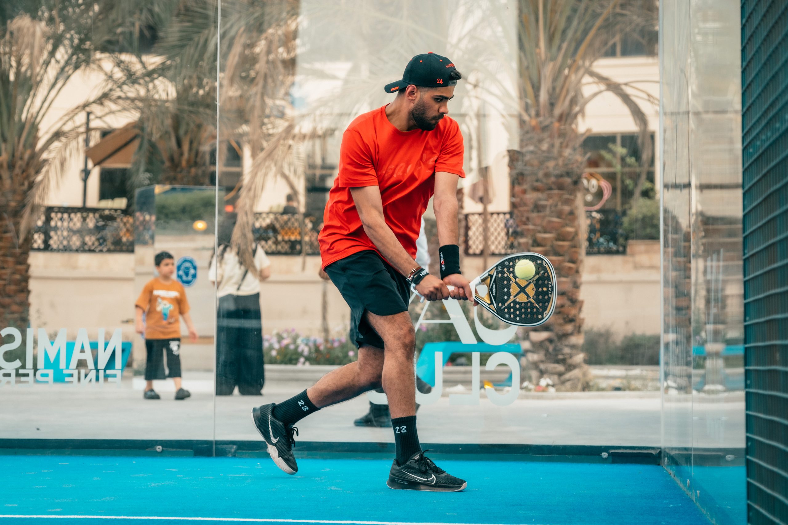
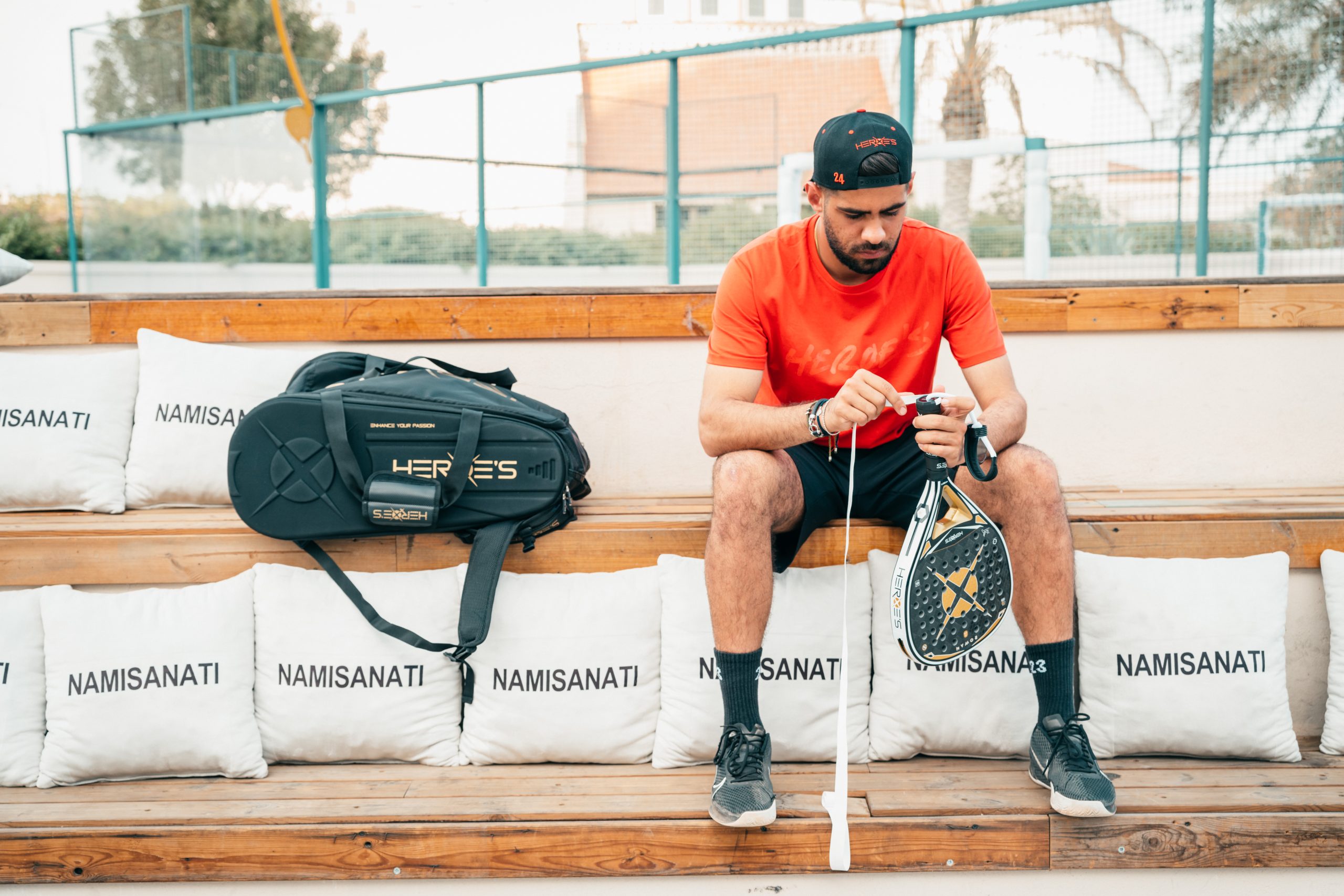
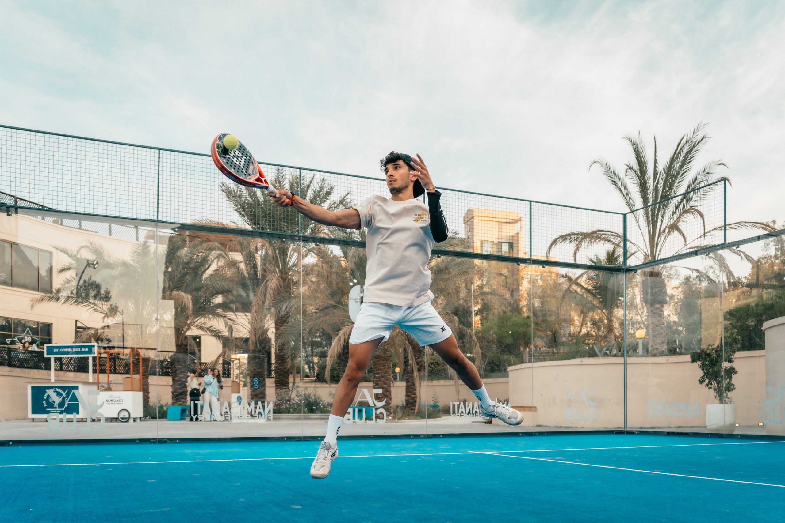
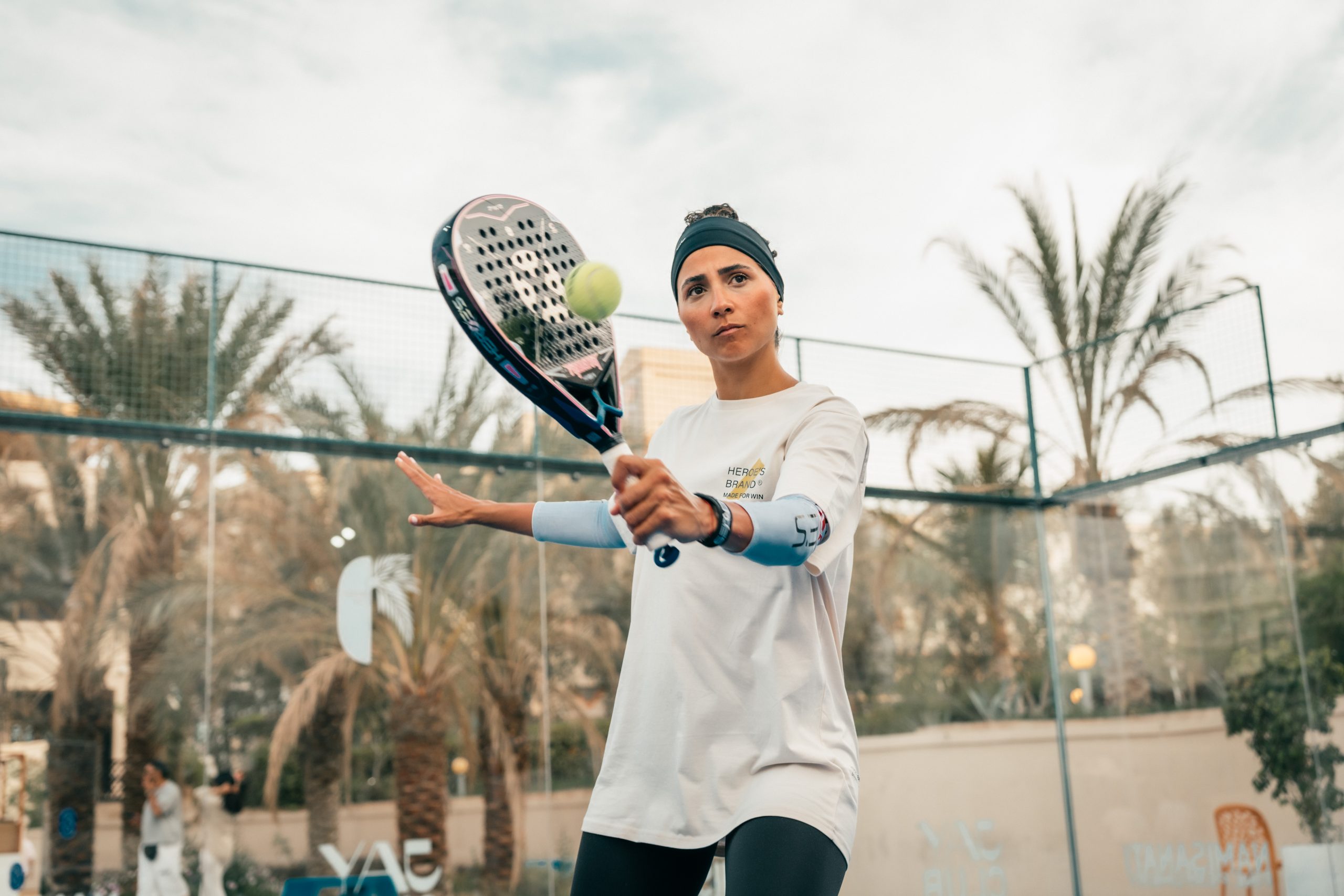
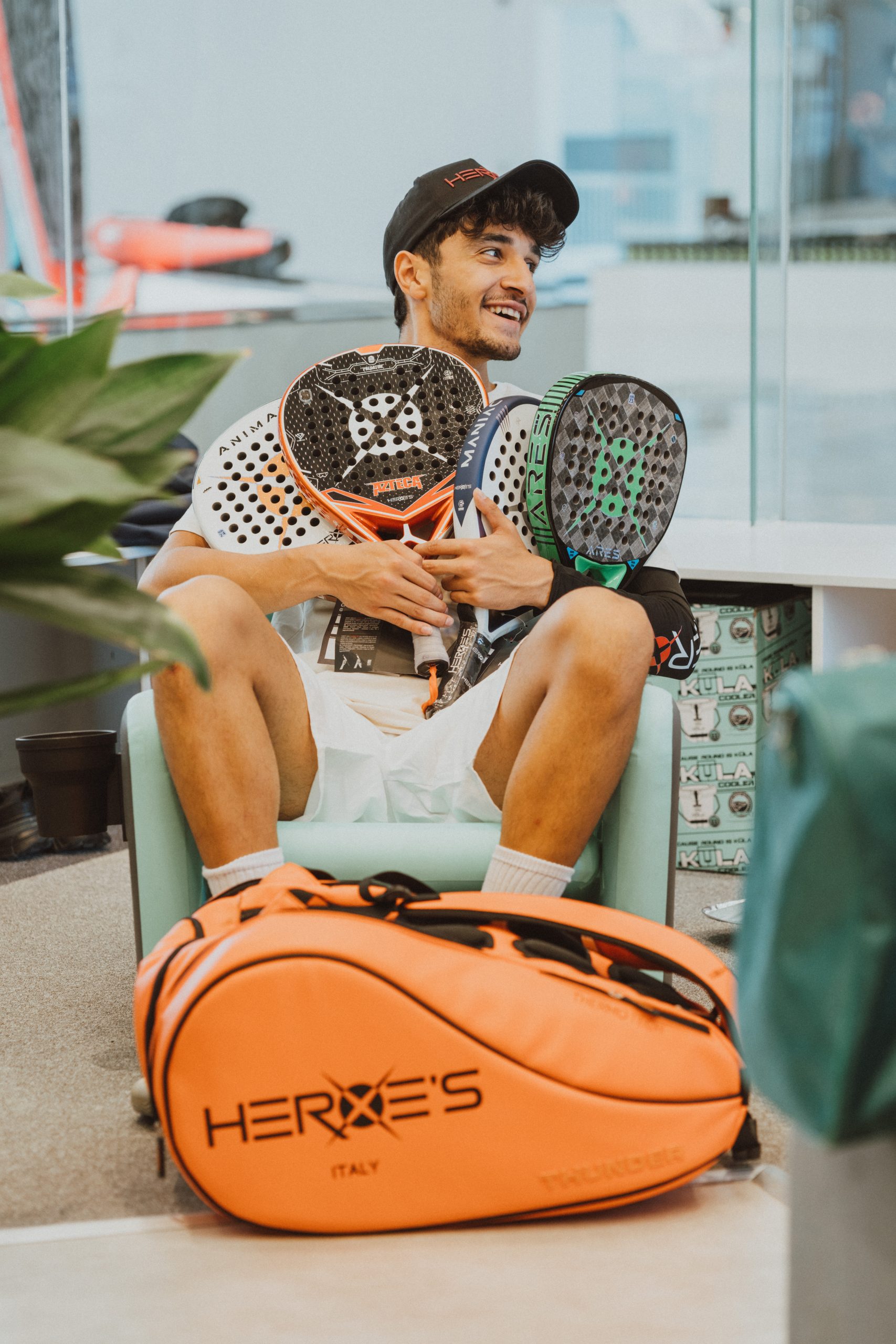
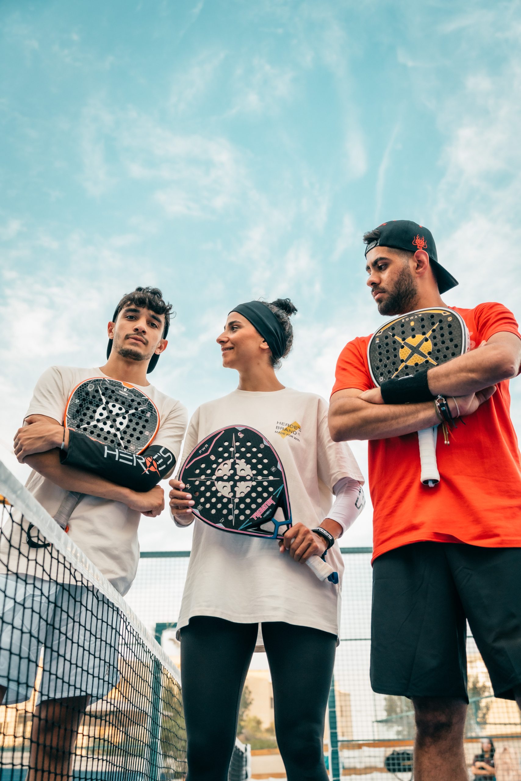
Padel / Island
Farkam
Where Craft Meets Character. A visual study in material, detail, and the quiet confidence of well-designed form.
In this series, I set out to highlight the subtle strength and refined identity of the Farkam brand. The focus was on form, texture, and the tactile language of the product — whether it’s wood, metal, or fabric, each surface speaks with intention.
The goal wasn’t just to show what the product looks like, but how it feels: how light touches it, how shadows fall, and how space interacts with design. Clean compositions, neutral tones, and controlled lighting allowed the brand’s essence to take center stage.
Working with Farkam gave me the opportunity to explore the relationship between functionality and elegance — a quiet conversation between object and environment. Each shot is an invitation to slow down and notice the details.
Whether for branding, catalog, or storytelling, this collection brings out the beauty of intentional design — simple, confident, and timeless.